Snavies
Remember the time you went to get popcorn at interval and almost missed half of your movie. How about we deliver your order to you.
Snavies is an initiative for controlling crowd at movies as well serving our customers with the assurance of customers comfort. So that they don’t have to get up from their seat or worse miss their movie!.
Project duration:
April 2022 to June 2022
Problem:
Ordering food at the movies take up a lot of time waiting in a long queue.
Solution:
Snavies is a website constructed to bring your order to your seat, so that you don’t miss out on your movie while waiting in a line. And also its beneficial for avoiding crowd and even with movies reopening we can prevent another pandemic.
Roles:
UX designer leading the app and responsive website design from conception to delivery
Responsibilities
Conducting interviews, paper and digital wireframing, low and high-fidelity prototyping, conducting usability studies, accounting for accessibility, iterating on designs, determining information architecture, and responsive design.
Usability study: findings
Round 1:
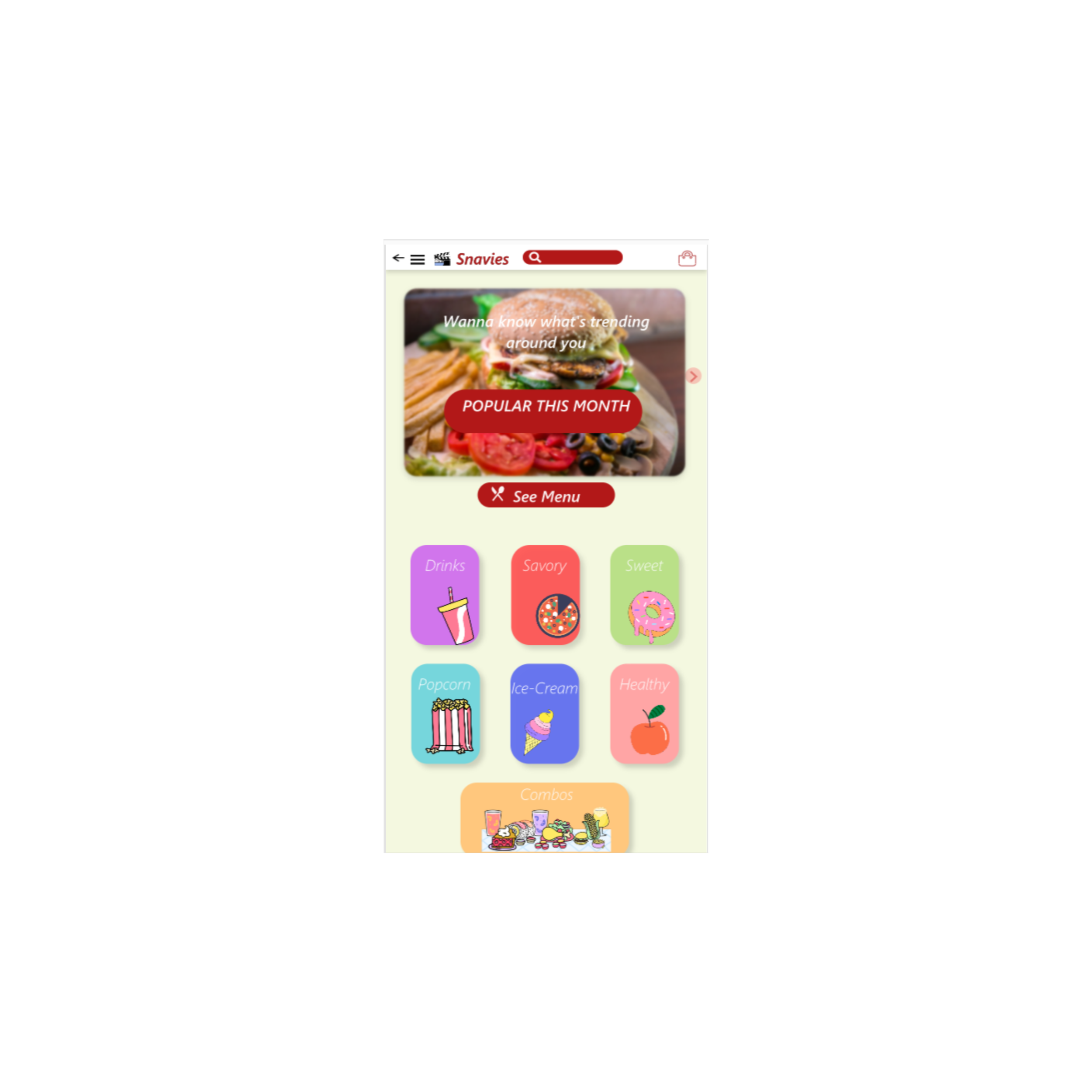
Users were happy to see the food distribution on home page.
Participant wanted cart page with more info.
Participant didn’t have any issue reading.
Round 2:
Participant was glad that they didn’t have to log in before, for browsing.
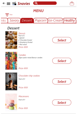
Participant liked the info of price ensuring no hidden charges.
Participant was happy that the buttons were clear and big.
Responsive Design
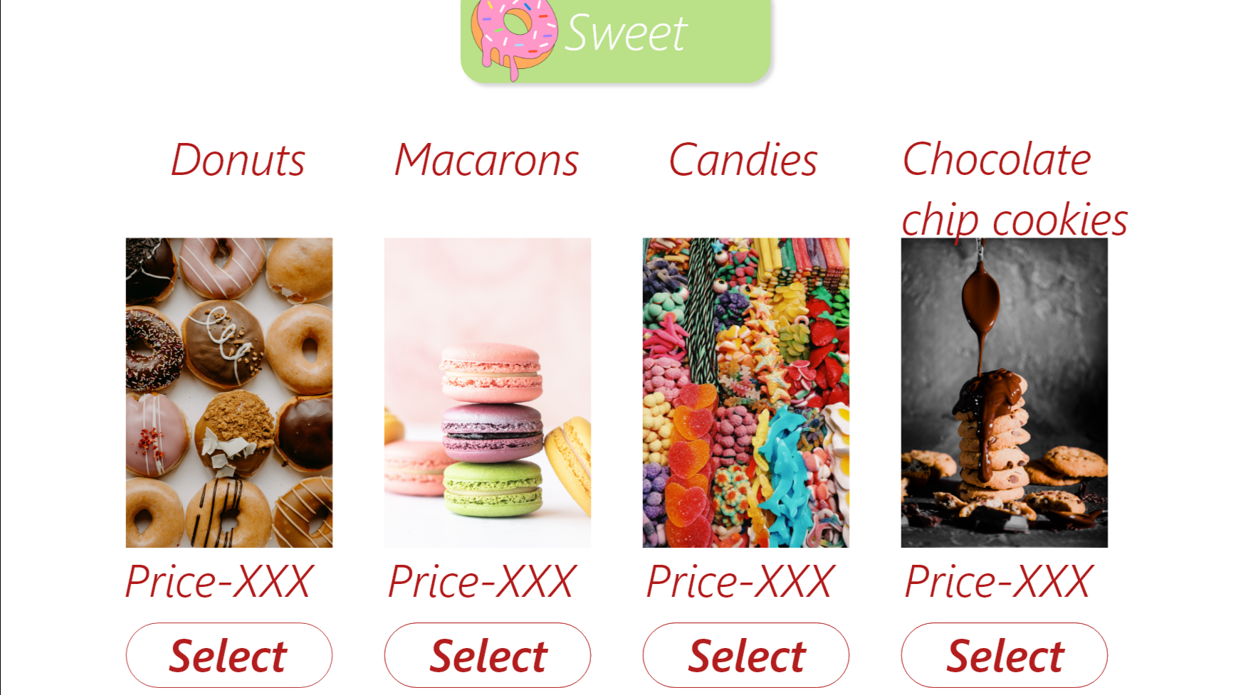
The difference and similarities can be observed in the between the designs for desktop and mobile phone.
Key challenge
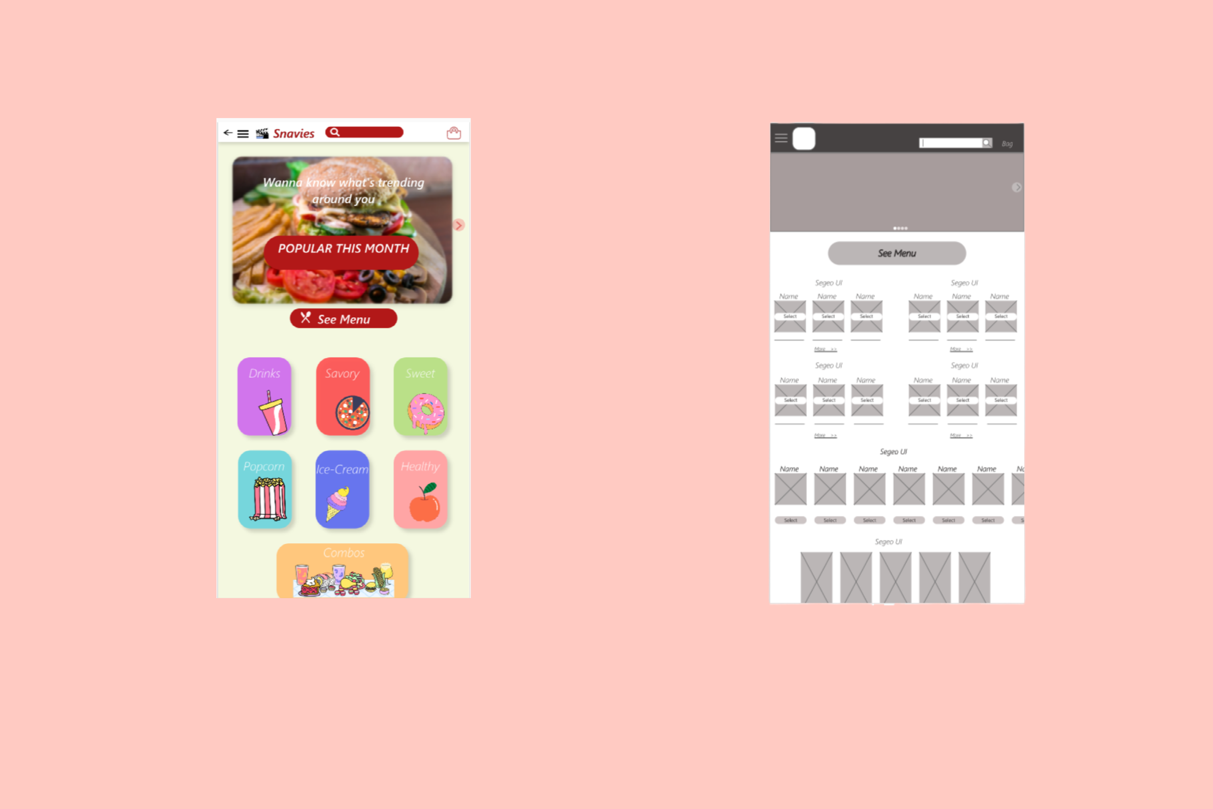
One of the many challenges was coming up with a organizing design for home page was tough, especially for the mobile version, I wanted to keep the uniformity between the desktop and mobile version. So each small square was suppose to be food pictures, but it looked clumsy and felt like too much clutter hence the change.
Wireframe
As we can see with the comparison between these two pictures. Wireframe had group of three for each category.


Accessibility consideration:
The change of colour of fonts and icons from white to black to increase the contrast.
Change of colour in icon when in that page/window. like for bag the has a white fill.
Adding the customizing button at the bottom and not along with each option so that user can select orders at once and customize them 1 by 1.
Conclusion
During this project I mostly focused on using more white space. And I also learnt how to be more detailed with less words and using more pictures. Next I am planning to conduct a research on how successful we are to reach our goal and incorporate the suggested changes into the design if needed.
Next steps:
Conduct another usability study and discover the pain points and scopes of improvement.
Iterate and improve based on the new feedbacks.


